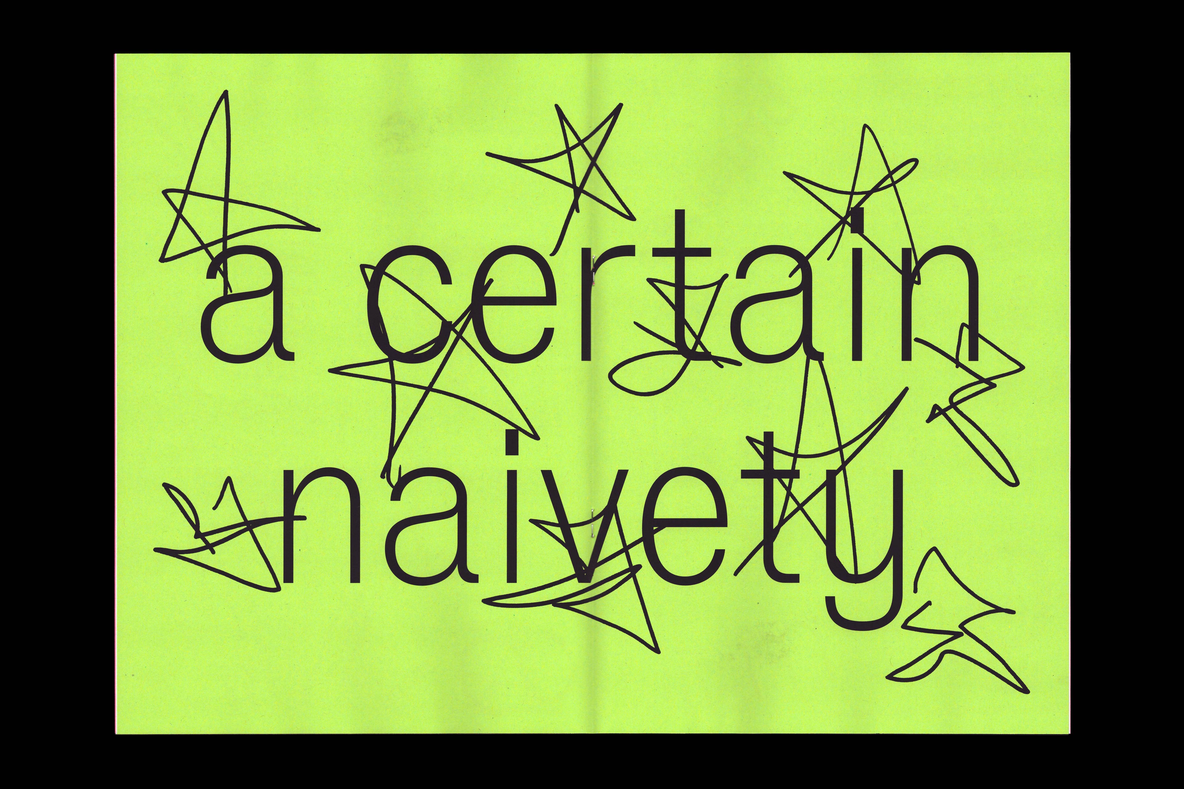
Let yourself be bad at things
In autumn 2022, we taught a four-month micro-degree course in type design at our alma mater, the Estonian Academy of Arts in Tallinn. Alongside technical aspects of typeface development, the course included guest visits from local and international type designers and regular drawing sessions.
One of the participants was Laura Pappa, an EKA alumna who now teaches on the Graphic Design MA course. Laura was mainly interested in free-hand lettering and building alphabets from sketches, but towards the end of the course she decided to try designing a sans serif typeface. One of her long-time favourites is Bauer Type Foundry’s 1907 typeface Venus, which influenced her early graphic design work and subsequent type choices. Venus is still used in the identity of ROZENSTRAAT — a rose is a rose is a rose, a gallery and project space in Amsterdam, where Laura is based.
Laura set out to create a new version of Venus, inspired by its amateurish qualities. In her graphic design practice, she similarly avoids overly slick or polished results, preferring to preserve the nuances of human communication.

After the course, Laura was left with an unfinished Regular cut and began wondering what might become of it. She eventually asked us to turn her design and sketches into a workable typeface. Originally intended as something for her personal use, it was to include Regular and Thin cuts as well as italics.
We found the invitation intriguing and decided to take Laura’s files and sketches as a starting point rather than simply making a new Venus. Together, we developed a typeface that celebrates quirks, imperfections and even mistakes.
About a year into the process, Laura suggested releasing the typeface through our foundry. We saw potential in sharing it more widely, and eventually decided on five weights plus a variable version.
Our conversations focused on making the typeface feel simple and, in some ways, universal, while avoiding familiar type-design gestures and, in Laura’s words, “unnecessary additions”. We developed the Regular and Italic first, followed by Thin, and finally the Bold end of the spectrum. From the beginning, we wanted the different weights to share the same character width, making it a uniwidth, or duplexed, typeface. This means users can move between weights without affecting the text flow, while the variable font allows even more fine-tuning options.

The typeface also went through a small parade of possible names before eventually becoming Vee. Early proposals included Linus, Reamus, Peanuts, Silvi, Pallas, Eris, Juno, Vesta, Fria, Flora, Metsik, Luna, Isola, Vonness, Femus, Janis, Nebulus, Pokus, Priius, Reesus, Renus, Revenus, Servus, Siblius, Siinus, Vemus, Veneres and Zenus.
Publication
By spring 2026, Vee had taken shape and we began discussing its launch. Laura wanted to create a printed specimen, and after exploring several directions, we settled on a conversation between the three of us about amateurism, mistakes, collaboration, mostly focusing on Tüpokompanii’s practice.
The conversation took place over Zoom on 1 June 2026, with Laura joining from her home in Amsterdam, Aimur from Tüpokompanii’s studio, and Andree from home while also entertaining his children. We discussed how we got into type design, how we began working together, and how our practice grows out of graphic design tools and thinking. We also talked about our typefaces, commissioned projects and the ideas behind our new collaboration, Vee.

Our friend Else Lagerspetz helped edit and translate the conversation. The Estonian publication came to be called “Ekseldes ei eksi” (roughly, “you won’t get lost wandering”), while the English edition, “Let yourself be bad at things”, takes its title from a quote by American TV host Conan O’Brien, a big favourite of Laura’s.
We spent a day at Niine, the Graphic Design MA students’ project space, printing the publications on the department’s risograph with the help of Eva Claycomb, and continuing some of the conversations from the interview — with some local gossip inevitably mixed in.
The launch was planned for the beach beside Linnahall, but ten minutes before it began, an Estonian summer storm brought strong winds and rain. Luckily, our friends at Logi sauna let us move inside. Benches became tables and seating, while home-made bread, dips, cookies and lemonades made for an unexpectedly fitting sauna reception. We read from the publication, talked about the typeface and, most importantly, caught up with friends over a drink.

The typeface and publication are now available. The publication can be ordered for €7 + shipping, or you can visit our Tallinn studio for a chat and a complimentary copy.
You can also read the conversation and download the digital version here: